Concourse: Solving the problem of pipeline monitoring
Background: With the growing popularity of Concourse, we noticed that our development teams wanted to observe and monitor multiple pipelines simultaneously. This behaviour wasn’t limited to just Pivotal engineering teams; in fact, it was even more prevalent among our Open Source Community. Our users currently solve this by cramming multiple browser windows into their TVmonitor view or they use the Concourse Summary (aka Crystal) by David Goddard of the Pivotal Buildpacks team.
Problem: How does the Concourse team go about solving the problem of pipeline monitoring?
Application: Concourse is an automation container orchestration tool for scheduling, testing, packaging and release life-cycle management.
Users/Persona: Enterprise developers
Use Case: CI/CD for developers to package and manage releases of their applications.
Competitive Tooling: Jenkins CI
Team Composition: Product Designer, Product Manager, Anchor Engineer, 15 Engineers
My Role: Product Design Lead. I was responsible for the end-to-end discovery, user research to implementation and iteration of the feature.
Process:
So, we embarked on a deeper Discovery effort with the goal of understanding and evaluating our assumptions around how Concourse users were solving this problem today.
At Pivotal, we believe that products’ solutions need to be designed with the user in mind and we practice a style of user-centered design that progresses in four phases:
Learning: How are users solving this problem today?
Framing: Formulate a hypothesis based on your learnings. Create a prototype or experiment that is based on the exploratory research.
Assessing: Put your experiment in front of users to see if your hypothesis is right.
Iterating: Repeat steps 1–3 to iterate on the solution as you get feedback.
Learning: Understanding the problem space

Development teams observing and monitoring multiple pipelines simultaneously before the dashboard view
We began this process by thinking about the assumptions that were made about this feature and what we needed to validate in our interviews.
Users were not satisfied with the single pipeline view — especially on a monitor vs. a dedicated CI display like a TV
Only seeing red or green pipeline status is all that is important for pipeline summary
Users wanted to understand the state of all their teams
Users recognized their pipelines by their shape in the UI
After we went talked to users in the field, we came back and synthesized our findings using a virtual whiteboard tool called Miro board. One of our team members was remote, so this tool allowed us to easily collaborate on our research in a shared virtual workspace.
“Did it just turn red 10 seconds ago, or one week ago? I have no idea.” — a Pipeline Engineer
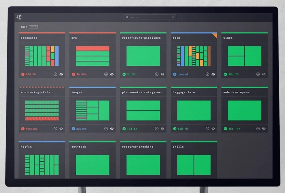
From our research, we found that users only care about failed jobs and the amount of time that their pipeline has been failing. This information is crucial for engineering teams as it is used to triage their pipeline errors and influences the prioritization of work. Many development teams we talked to are using a microservice-based architecture and therefore most of their pipelines are composed of four jobs (build, test, deploy and health check). While we assumed that the shape of a pipeline would be identifying, it was more important for the user to see the status.
Based on the feedback we collected we began to prioritize our insights and frame our solution. We proceeded to brainstorm and sketch ideas for a prototype experiment.
Framing the experiment: Early dashboard prototype
Our first InVision prototype represented each team’s pipeline as a series of thumbnails. We believed this approach would help users identify their pipelines, and at the same time, have an at-a-glance view of the pipeline status. Our first round of user feedback revealed that the thumbnail was not as useful as we had thought; and our approach made it more difficult to understand the pipeline status.
So, we pivoted and started to explore the idea of a pipeline thumbnail that abstracts the current pipeline representation into a more substantial information radiator.
Alex Suraci, co-creator of Concourse, had been working on a UI experiment based on a treemap chart (below), which looked like something we could expand upon. I hypothesized that by removing the resources from this view and stripping down the thumbnail to jobs only we could provide the user with just enough information for at-a-glance triaging.


Remote zoom user testing with the MySQL R+D team in London
This was a radical idea and a significant departure from the current visual style of Concourse. We didn’t want to just “do it” and release it to our community of users without some kind of feedback first. As a product designer, my first inclination was to start drawing up thumbnail variations that we could test with our users. However, there was no clear taxonomy of pipelines because every team at Pivotal has a drastically different pipeline configuration. We needed a quick way to test the design with “realistic” pipeline configurations at scale. Luckily for us, the Concourse team runs an internally managed multi-tenant instance of Concourse called Wings. We use Wings as a sandbox for new features, so I paired with an engineer to do a lightweight implementation for Wings.
Assessing the outcome:
Since our initial rollout of the dashboard on Wings in September 2017, we have undergone at least three major revisions of the dashboard based on the feedback from teams within Pivotal. Our next step was to incorporate the dashboard into the core product as a beta feature without disrupting users who are looking for a more stable Concourse experience.
As of Concourse 3.5.0, you can find the dashboard under /dashboard/ and, as of Concourse 3.6.0, you can find the dashboard under /beta/dashboard. We hope you like this feature and are actively looking for feedback from the community.
If you have a comment and want to participate in the conversation for the dashboard UI, please visit the issue in GitHub: https://github.com/concourse/concourse/issues/1829 .
Curious to learn more about concourse?
The official site for documentation, reference material, and example pipelines (which no longer live in this repository).
The Making of a Cloud-Native CI/CD Tool: The Concourse Journey
The Concourse Tutorial by Stark & Wayne is great for a guided introduction to all the core concepts.
See Concourse in action with our production pipelines
See what we're working on in our project board.